The fate of the current season is hanging on by a thread amid the coronavirus lockdown. As further time passes, it is only conceivable for clubs to start preparing for the next season.
As for Liverpool fans, the ever-reliable source, Footy Headlines, has brought them something to look forward to.
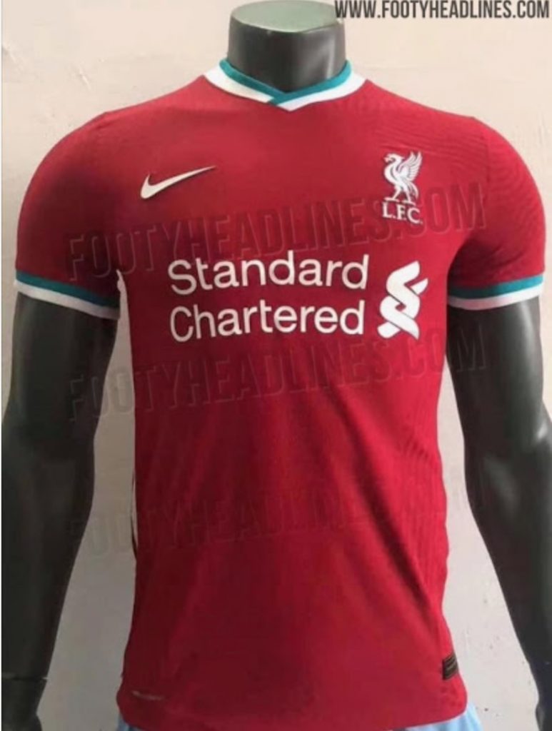
The site has raised the curtains to reveal fresh images of the Reds’ home outfit for the next season as Nike takes on the sponsorship duties from New Balance.
Following Nike’s generic 2020 template, the strip combines the wine-red theme for the jersey with the amalgamation of white and teal colours for the collars and sleeves, with other usual graphics accompanied to it.

Nike fails to impress
Fans aren’t exactly impressed with the new kit design, to say the least.
While most people do not take offense to the outfit, per se, there was a general consensus on social media that Nike, as usual, just “didn’t do enough”.
Many opposed the inclusion of the teal coloured trims, a colour that seems alien when put on a Liverpool jersey. After all, no shade of green has ever made it onto the Reds’ home kit throughout their history. This, even after the green and white away kits that came about in 1991.
Another gripe that fans has was that the jersey was simply boring, with not much going on. There aren’t any standout design choices at all and the kit just looks bare.
In fact, Nike has even taken out the golden liver bird in favour of a white motif to go along with the jersey’s overall theme. As expected, this did not please the Anfield faithful at all.
Apart from this, however, people were actually in praise of the kit. They did concede that the kit, even if lackluster, looked clean and solid.
All in all, Nike’s first effort as Liverpool’s kit supplier came off as mediocre at best. While not overly upset, fans will be hoping to see this effort bettered massively in the years to come.


