In the last few years, the re-envisioning of football kits has gained immense popularity. Major brands like Adidas, Nike, and Gucci have previously worked with the concept kit creators.
These designers usually put out their content on the internet and garner the attention of major clubs or brands. Later these brands and clubs collaborate to bring these ethereal kits to life. The advent of these kits has improved the sales and brought in immense profit for the clubs.
Until recently, football kit design was largely done at the production offices of the big brands, with little or no major changes. Kit designing was mostly neglected. But now, with the help of social media, the fans have been demanding a change every new season.
The third kit is usually the place for the clubs to think outside the box, and have fun with new concepts. They try to break away from the conventional design and colour of the club’s regular jerseys. Websites like The Football Shirt Collective help bring many concept kits into the limelight. One such designer who has grabbed the attention of fans recently with his kit collection is @victorieux35.
The fiery concept kit
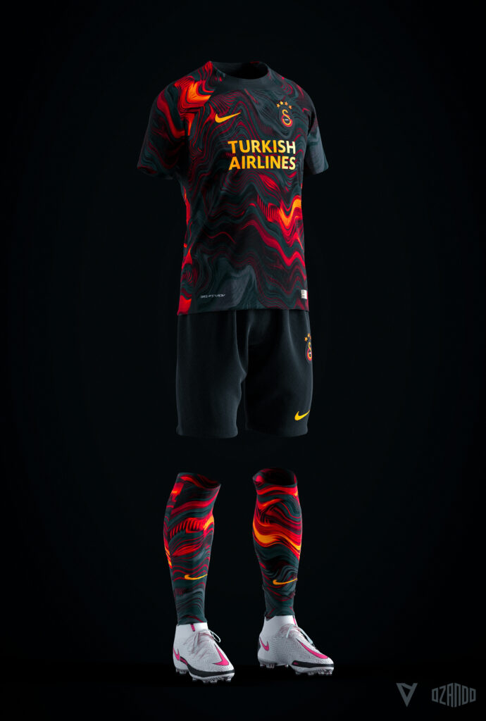
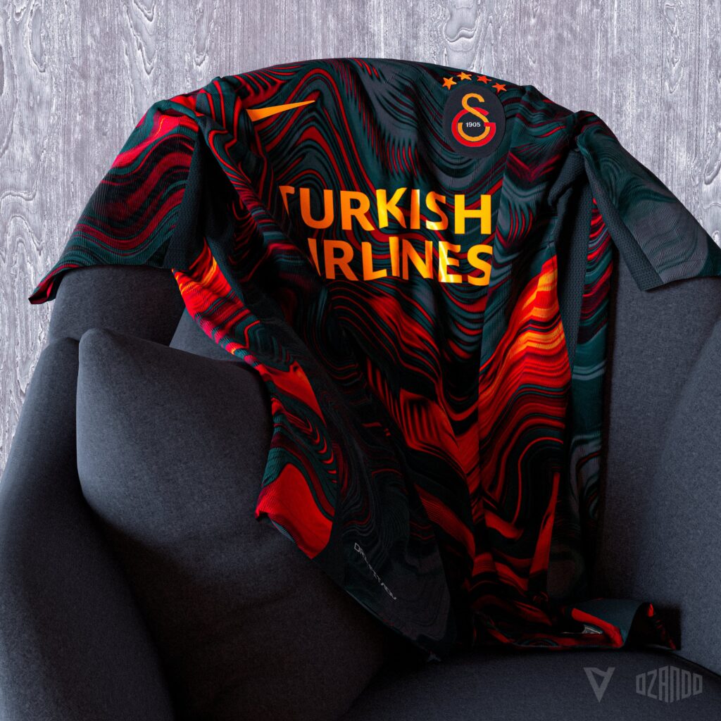
In collaboration with sports apparel designer Ozando Creative, victorieux has released the concept away kit for Galatasaray FC. The design has stunned the fans and they just can’t get enough of it.

The designers have been playful with the colours of the club. The colours have been presented in a wavy structure, as they are laid out in black. The waves remind us of molten lava as it glazes out from the contrasting base. They have blended the red and yellow colours of the club to give a fiery outlook to the waves.

This kit seems to be a modified version of their away kit of this season. The present kit also has black as the base colour, with the yellow and red stripe running horizontally across the middle. The third kit is however in stark contrast to the concept design. The third kit of this season is entirely created around white.

The shirt is also punctuated with similar wavy lines that camouflage with the colours. The Turkish Airlines (Galatasaray kit sponsors for European games) tag covers the centre of the shirt along with the majestic logo of the club in the top right corner.
Football shirt aficionados are astounded by the concept design
This guy’s like the Mateo Kovacic of concept kits. Doesn’t do a lot of concepts, but boy are they bangers when he does. https://t.co/s9wbeX7GT4
— Jack Henderson (@hendocfc) January 31, 2022
This is a render
— Baenjimina Bodwaeze (@bodwez) February 1, 2022
This is a render
This image is not real
We’re truly in an incredible era https://t.co/7ohQQZEyRP
This is AWESOME! Well done to these designers! https://t.co/3HSgWIbk3e
— Mike Meredith (@_mikemeredith) January 31, 2022
Nike, YOU MUST SEE THIS! https://t.co/1CLWtTXAQD
— Mr.Brightside Shirts (@ShirtsFromBcn) February 1, 2022
Here’s hoping that Nike and Galatasaray embrace and bring this third kit design alive!


Gostaria de ver mais modelos