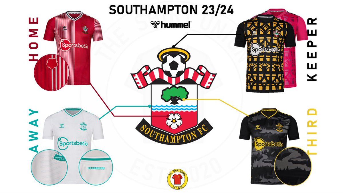
Southampton might be playing in the EFL Championship in the 2023/24 season, but manufacturers Hummel has ensured that at least they’ll look good in some beautiful kits. The Saints suffered the drop to the second division after an 11-year stay in the Premier League and now have a hard road back to the top division.
They have been undergoing chops and changes all through the summer, Mislav Orsic, Ibrahima Diallo and Mohamed Elyounoussi all being offloaded. At this point, it appears that midfielders Romeo Lavia and James Ward-Prowse could also leave before the start of the season amid their links to a move back to the Premier League.
Southampton are aware that they’ll need to fight tooth and nail to survive the crazy competition in the Championship and jump back to the Premier League next year. Hummel, however, hasn’t compromised on their quality of work in terms of designing their three kits for the upcoming campaign.
Southampton’s three unique kits for 23/24 season
The home kit has been changed in a major way. From last season’s attire which was mostly white with a massive red pattern down the centre, Hummel has changed this season’s home kit to feature more of the red colour.
This time, the kit, a recreation of ’87-89 jersey, has two sides with the right one being fully red and the left one a stripe of red and white.
The Saints’ away kit is also a major change from last year’s bold teal and aqua design with a weird pattern. This year’s away attire is much more cleaner and simpler, as it’s just white attire with the logo, neck stripes and sponsor names being in the teal colour.
Hummel has gone with an interesting pattern for their third kit, which will be alternatively used by them for away or cup games. They have gone with what looks to be a ‘tree’ pattern for the black third kit, with a golden touch to it in the sponsor names and neck stripes.
With that being said, these interesting colour combinations are not ones randomly chosen by the manufacturers. It appears that they have taken the inspiration from Southampton’s own club crest when designing their kits for the 2023/24 season.
The club crest inspiration in all the kits

For example, their home kit takes inspiration from the red and white scarf that is featured on the crest. The white rose on the crest, which is a symbol of Hampshire, is also featured in patterns in the home kit.
The away kit has a white colour and a teal colour that is featured in the ‘waves’ in the Saints’ club symbol. These waves actually have a major cultural meaning to the city of Southampton, representing their prominence as a shopping port and dock area over the course of history.
Hummel have also incorporated the tree on their crest into their third kit through their interesting pattern. The single treat symbolizes the New Forest and Southampton Common, which is where the club is situated.
Hummel has even designed the two goalkeeper kits by paying homage to the Southampton crest. The home keeper kit has incorporated the golden halo that is situated atop of a football in their crest, which is a tribute to Southampton history with the Church of England.
At a time when shirt manufacturers are constantly experimenting with football clubs’ shirts, Hummel has actually kept Southampton’s values intact through their gorgeous kits and ensured them to be a hit among both the older and newer generation of supporters.


