
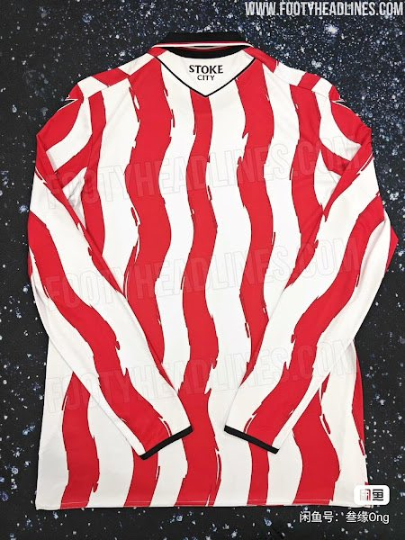
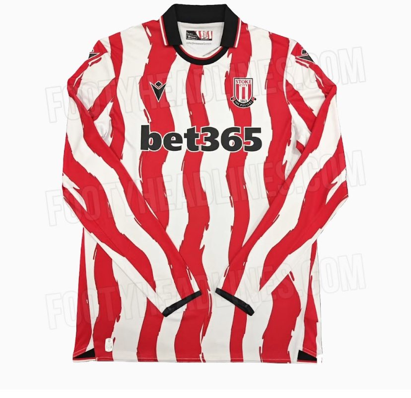
A Kit So Wavy, Even the Stripes Are Doing the Macarena. That’s right—Stoke City‘s 2025-26 home kit has hit the internet, and to say it’s sparked conversation would be an understatement. Leaked images suggest that the Potters’ iconic red and white stripes have taken a rather expressive turn, and fans can’t decide whether they love it, hate it, or need a moment to process it.
Footy Headlines, the ever-reliable kit leak detectives, were quick to report:
“Exclusive: Stoke City 25-26 Home Kit Leaked. Footy Headlines can leak what appears to be Stoke City’s home kit for the 2025-26 season. The design shows a dramatic reinterpretation of the club’s traditional red and white stripes. We cannot finally confirm the authenticity of Stoke’s new 25-26 home uniform, but everything indicates it is real.”
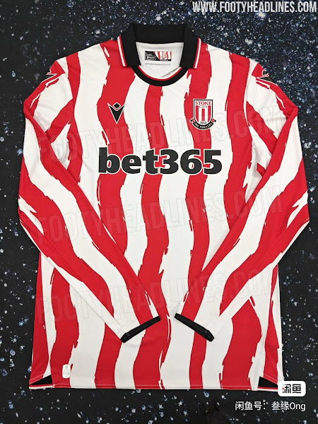
Translation? Stoke City’s designers have thrown tradition in a blender, added some artistic flair, and poured out a kit that looks like it might’ve been painted mid-earthquake.
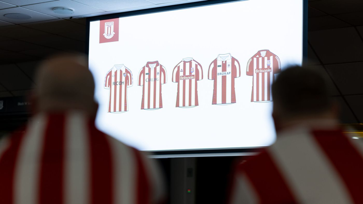
The Great Stripe Shake-Up
Macron, Stoke’s Italian sports kit manufacturer, has clearly taken inspiration from something—whether it’s abstract art, a flag waving in the wind, or an optical illusion designed to disorient the opposition.
According to the leak:
- The usual straight red and white stripes have been swapped for wavy, brushstroke-like patterns.
- The kit features a black collar with white trim, plus matching black cuffs on the sleeves.
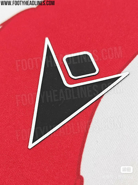
- Macron’s logo appears in black, while the classic Stoke City crest remains in its rightful place on the left chest.
It’s bold. It’s different. And depending on who you ask, it’s either a fresh take on a classic look or an affront to football kits everywhere.
Wait… Didn’t Fans Choose This?
Now here’s where it gets really interesting. Stoke City actually let fans have a say in the design of the 25/26 kit. This wasn’t just a designer’s fever dream—this was democracy in action!
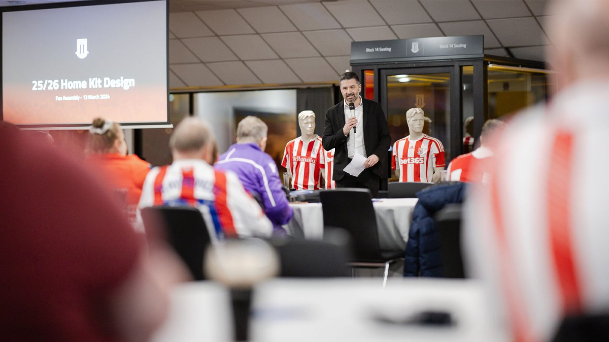
Back in June 2024, the club made a big deal out of their fan engagement efforts, announcing:
“City supporters shape design of 25/26 home kit. Final decision made following two Fan Assemblies. Kit to be launched in the summer of 2025.”
Essentially, fans gathered in March to debate what makes the perfect Stoke City home jersey. Some wanted tradition, some wanted change, and one person probably suggested making it invisible to confuse opponents.
Additionally, club legend Ryan Shawcross also was involved and debated what makes the perfect home jersey. After two Fan Assemblies in March and May 2024, they voted on the final design.
By May, a final vote was held, and the wavy-striped masterpiece (or monstrosity, depending on your taste) emerged victorious. Stoke City’s Chief Operating Officer Simon King proudly stated:
“We have enjoyed two invaluable, thought-provoking sessions with supporters, which have ultimately shaped the design of the new kit for 25/26. Throughout the two meetings there was much debate and wide-ranging views, though, once the final designs were created, there was a clear winner from the supporters’ vote. The process reaffirmed our belief that effective two-way dialogue is massively beneficial for Club and supporters and can lead to well-informed decisions.”
So, this wavy, avant-garde design? It wasn’t just Macron going rogue—this was what the fans voted for. But now that it’s leaked, how do they actually feel about it?
Fan Reactions: A Mix of Confusion, Excitement, and Banter
Social media went into overdrive after the leak, with reactions ranging from admiration to absolute bewilderment. Here’s a breakdown of what people are saying and why:
“This Stoke City shirt is a rootin’ tootin’ riot.”
- Accompanied by a US flag emoji and #USStoke, this fan is playing into the growing American support for Stoke City, particularly among newer overseas fans.
- The phrase rootin’ tootin’ is an exaggerated cowboy expression, which adds to the humor—it’s as if the kit’s design is some sort of wild west adventure.
“Isn’t that an Atlético shirt?”
- Stoke City’s red and white stripes have always drawn comparisons to Atlético Madrid, another famous club with a striped home kit.
- With this new design featuring fluid stripes, the resemblance is even stronger, making some fans joke that Stoke might as well be an Atléti B team now.
“Macron be doing Macron things. If I was a purist, I wouldn’t be too happy, but I think this is great.”
- Macron, the kit manufacturer, is known for bold and sometimes controversial designs.
- The fan acknowledges that traditionalists might hate the wavy stripes, but personally, they love it.
“I’m supposed to hate this, but I don’t. Perhaps it’s because Stoke City shirts are rarely interesting.”
- A brutally honest take.
- Historically, Stoke kits haven’t exactly been revolutionary, so this shake-up is refreshing for some fans.
“Could easily go wrong, but saved by the neat execution.”
- A very balanced review.
- The design itself is risky, but the black collar, cuffs, and overall styling make it work.
“As a Stoke fan, I want to hate it for not having straight stripes, but I actually quite like it.”
- A sentiment echoed by many.
- While it technically defies tradition, it’s also… kinda cool?
“We are also changing our nickname from the Potters to the Dart Frogs.”
- Dart frogs are a species of brightly colored, poison-dart frogs with striped patterns, often red and white.
- This fan is sarcastically suggesting that, with this new kit, Stoke should embrace a more exotic identity.

“If this is actually the kit for next season, then my god, that is utter class in my opinion. Thoughts?”
- A pure, unfiltered enthusiastic approval.
- This fan loves the kit but is also curious to see if others agree.
“Wonky stripes are sh*t. Always have been. Always should be straight.”*
- A blunt traditionalist take.
- No poetic waxing here—just raw disapproval.
“I think it looks dreadful, the black detailing is nice, but the wonky stripes just make it look flimsy and out of shape, a bit like Stoke as a club at the moment.”
- Ouch. This fan not only criticizes the design but also throws shade at the club’s current state in the Championship.
- Stoke’s struggles in recent years seem to be reflected in the “out-of-shape” aesthetic of the kit, at least in this fan’s eyes.
Love It or Hate It, It’s Memorable
Stoke City’s 25/26 home kit might not be to everyone’s taste, but one thing’s for sure—it’s sparked a debate like no other. Whether you think it’s a bold artistic move or a crime against football shirts, it has undeniably got people talking.
And who knows? By the time it officially drops next summer, maybe even the harshest critics will have warmed up to those wonky, wavy stripes. Or at least, they’ll have found something else to complain about.