Concept kits and custom designs often offer such a creative version of a club’s kit, that fans can’t help but wish they were a reality.
And with the increasing number of kits leaks emerging in the past few weeks, numerous such concepts of various clubs have gained popularity, simply for being better than their official counterparts.
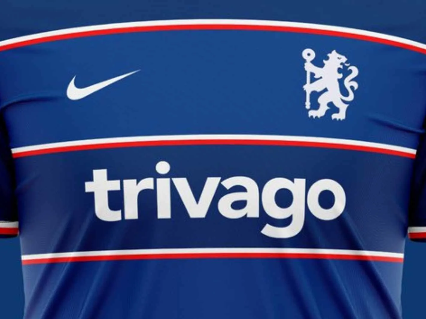
One such example is this gorgeous Chelsea home kit concept designed by @cfcAlex98.
The concept is drawing plenty of praise as it borrows from the past and offers a refreshingly modern take.
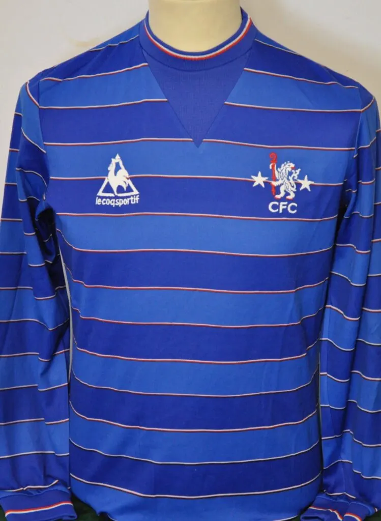
Taking inspiration from the Blues’ 1984/85 home kit made by Le Coq Sportif, the shirt goes for Hoops at the base, which alternate between shades of blue and dark blue.

Running across these hoops are red and white lined stripes. As compared to its predecessor, the stripes and hoops are better defined, offering a clearer overall look.
In line with the old club crest on the 84/85 kit, the modern refresh has a thematically similar version of the crest.
All sponsor logos are white in colour and instead of Three UK, who’ve had a rocky relationship with the club as of late, the sponsor in place on the concept is Trivago.
The concept managed to capture the essence of the original and offered a fitting rendition. And many online were taken away by the design.
Chelsea’s 1984/85 Home Kit Concept – decided to modernise it + add the Nike & Trivago logos #CFC pic.twitter.com/458mEPdC83
— AlexH🇧🇪🇺🇸 (@cfcalex98) March 27, 2022

