The season of kit reveals has been in full swing as of late, with essentially every league side joining in and showing off their threads for next season. So far the results have been interesting, fans have received kits that are pure eye candy, whilst also receiving some rather jarring looks.
There have been flashes of creativity such as Reading’s home kit which highlights a wonderful message.
Contrastingly, there have also been cases which display a severe absence of ingenuity, such as Macron ripping off their own design for Crystal Palace’s primary colours.
The various kits revealed so far have left fans awestruck and disappointed in equal measure.
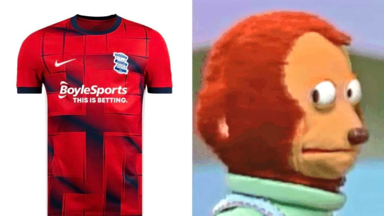
In fact, Nike‘s recently revealed away kit template had fans howling at their screens while simultaneously finding something to admire in the colour palette. And it takes only one glance to see why.
So far, this particular template has been utilized for clubs such as Ferencvaros, TSG Munich and Wieczysta Krakow among others.
While the primary shades for each club are different, the common denominator is the striped patterns, with fading vertical and horizontal lines running across the shirts. The colours in use are actually quite eye-catching, and each shirt even includes details on the collar and sleeve cuffs.
Unfortunately, the colours lost fan attention quickly, as their eyes wandered off towards the peculiar pattern in the centre.
Upon closer inspection, users online were scratching their heads in disbelief, as right below the horizontal and vertical stripes are thicker lines which resemble something eerily similar to a Swastika.
Birmingham City’s away kit was perhaps the worst offered as it included a red base, leaving little to the imagination
Many found the accidental Nazi reference to be howler and wondered how it managed to slip through numerous execs at the respective clubs.
Needless to say, we wouldn’t recommend walking around sporting the shirts, especially in places that may not be familiar with these clubs.

