While talking about the beautiful country of Italy, the city of waterways Venice, is a must visit place. An intriguing fact about the name is that in the Italian language it is called Venezia. For the football enthusiasts the Italian version rings a bell for sure.
Venezia F.C., a relatively unknown club till its promotion to Serie A in 2021, has been through a roller coaster of a ride. The club took up a journey from being bankrupt and playing in Serie D to joining the giants in Serie A in just 5 years.
The club has had a rich history in footballing terms since its inception in 1907 but what is even more likely to capture your interest is the fashion icon status that the club has garnered.
Venezia has been called “football’s most fashionable club” by fashion publication Highsnobiety and SoccerBible has referred to Venezia as “one of the most modern and innovative clubs in world football.”
How has the journey of Venezia apparels looked before they got famous is what peaked our interest and we dug in to find some of the ghosts of their past.
What is now a golden and black symbol of fashion wasn’t that originally. Original colours of Venezia FC were blue and red but within a year of its inception colours green and black were finalized for the outlook. First decade or two of the clubs kits were green and shades of green.
The club might seem small in stature but the brand value has always been top notch for the club. They have had deals with the likes of Nike, Puma, Umbro, Lotto, Kronos etc. even while they were down in Serie B. Let’s sift through some of the iconic looks throughout the years.
The Diadora diagonal stripes:
The home kit of the season 1992/93 sponsored by the Italian sportswear manufacturer Diadora introduced a change in design philosophy for the Serie B club.
With black still as the base colour of the kit, a diagonal line of green and orange in about 80:20 ratio ran through out the shirt in the direction of top left to bottom right.
“Giocheria” was the main shirt sponsor and the club, called A.C. Venezia then, had its logo on the left.
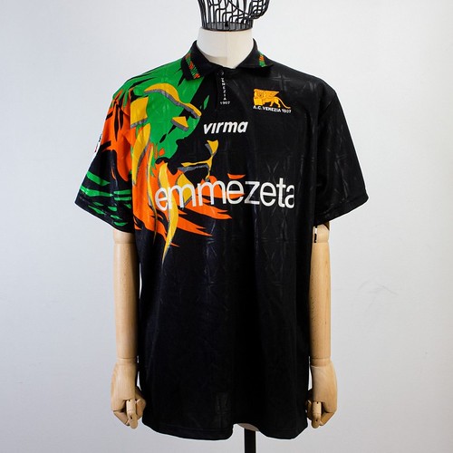
The Flaming Lion:
Mid 90s look of the club jersey leaves a long lasting impression on you. Again with the same colors of black, orange and green, a new picture was painted by Virma, the shirt designer. In the 96/97 season, the shirt featured the iconic lion of St. Mark in an airbrush paint style.
The look was so loved that it was even carried on to the next few kits and even the change of shirt designer to Kronos didn’t effect the design.
The Umbro Uno:
Umbro, the English sports equipment manufacturer since 1924, dabbled in the kit business for Venezia for a single year in 90/91 season.
Although the partnership was short lived, their kit style was admired aplenty. The home and away shirts were simpler designs but this time the base color of green was used along with a mirror sequin like cloth to give the kit a special shine.
The alternate away shirt was used during the Playoffs and the lucky shirt got them to Serie B that season. Alberto Zaccheroni’s side donned a white jersey with three stripes of green, black and orange making their way from one sleeve to another.
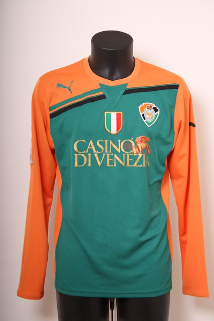
Puma kit of 12/13 season:
Puma lent a hand to Venezia during their bad days as they were trying to gather themselves in the post bankruptcy era. In 2012/13 season Puma designed a Serie D title winning jersey for the Italian club.
The green and orange were the main colours this time, instead of being used in highlights and details. The Italian crest rested in the center of the chest and the shorts were pure black.
Sadly, the resurgence didn’t last long for the club and they had to declare another bankruptcy after a couple of years, third in total in the history of the club.
The Red Wine:
Sometimes the kit designers like to use the creative brush to go out of the box and such a case in Venezia’s history was the wine red coloured 3rd kit in the 01/02 season by Kelme. The wine color and the white and blue details sure made people look twice.
Not all kits have happy memories as it turns out. The kit was worn twice and the team could only gain one point. The season turned out to be wash too as they got relegated but the silver lining was that they managed to hold Rome (2-2) and Inter (1-1) at home.
Nike tried to bring it back the colour in 14/15 season but it was just a plain and simple wine coloured shirt.
As you might have figured out by now, it wasn’t a sudden change that Venezia found themselves on the top of the fashion chain and after the American takeover of the club, only sky is the limit for this club now.
Don’t forget to tell us which kit was your favourite of the bunch.


