
When a new season is round the corner, the buzz is always around new signings and the release of new kits.
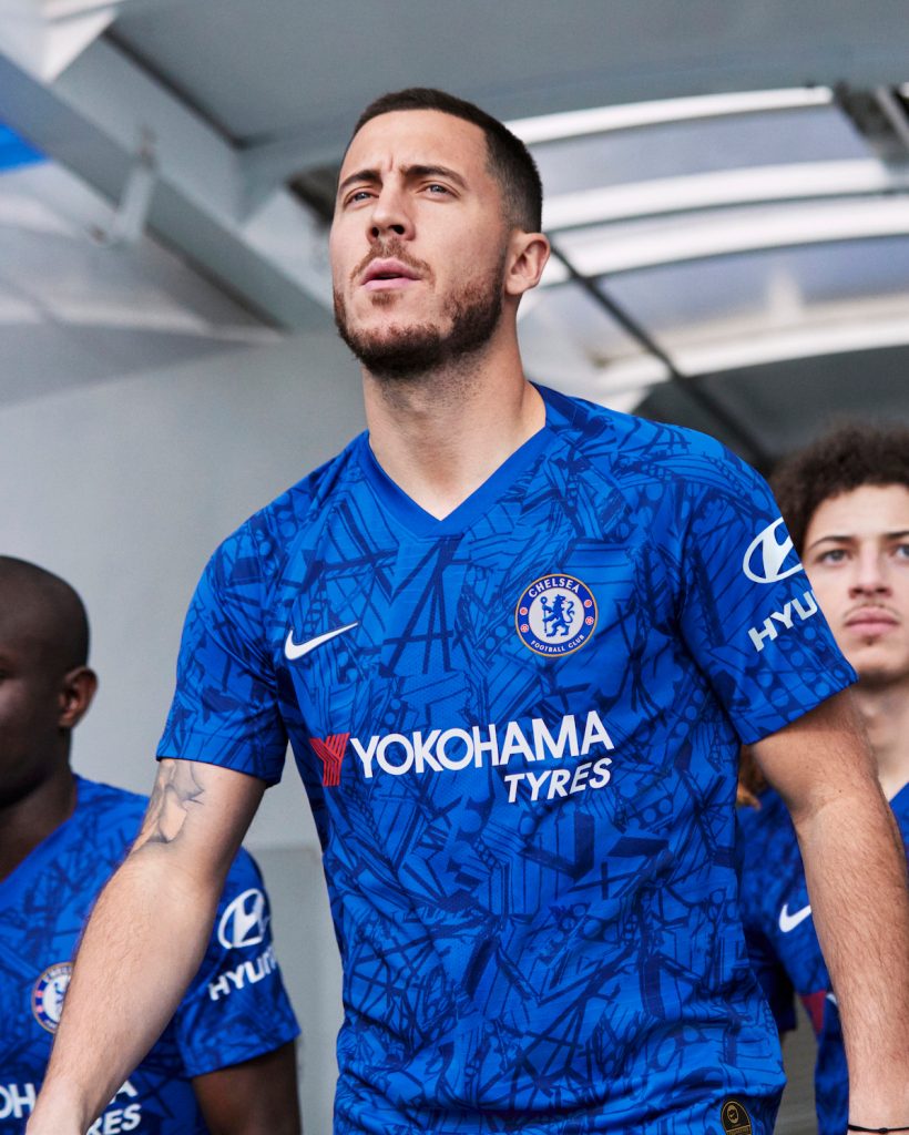
Chelsea’s current kit features bright white wave-like swirling patterns on the classic blue base giving it an ocean like look. These wave patterns present all over the front are based on a fire theme, and the notion that the hottest part of the flame burns blue.
For the first time the kit also features the colour orange on their home kit, both the Nike logo and the Chelsea badge have an orange outline on the edges with the core colours remaining as blue and white.
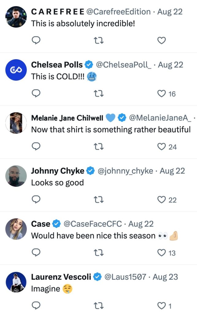
This attempt at a rather out of the box quirky kit has not landed with fans, many calling it the worst kit ever. Such a poorly designed kit has sparked designers like The Lampard View and Aspeiron to create designs for the future, looking forward to the 25/26 season.
One such design and a probable early look into potential designs is a concept kit based on the gold lion badge. This design by The Lampard View has impressed Chelsea fans and twitter users, and is a classy, neat and majestic look.
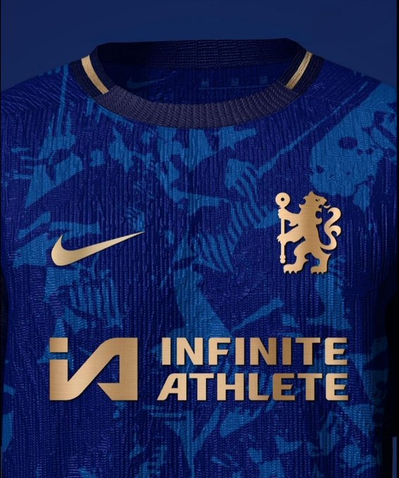
The design features a completely new look logo, design and colour scheme with the Nike logo and Chelsea crest embossed, giving it that 3D look. The gold detailing on this kit can be linked to the 23-24 kit that aimed at highlighting the prestige and glamour of the famous King’s Road in the 90’s.
With a royal blue base that is synonymous with Chelsea, the front features patterns in a lighter shade of blue, the patterns spread across the kit provide a nice variation not just in terms of colour but also a textured look to the kit.
Comparisons on the patterning can be drawn with the 2019-20 Chelsea home kit, where Nike experimented with a similar graphic across the front that tried merge all stands of the Stamford Bridge into one. The patterning on this concept could signify something different, although it is difficult to put a finger on what it might exactly represent.
The new look logo on the concept kit has done away with the iridescent circular badge that has been a staple on Chelsea kits. The kit features the ‘only lion crest’ holding the royal staff in shining gold that plays beautifully with the deep blue, a look in line with Chelsea being the Pride of London.
The lion, known as the lion rampant is based on the official coat of arms of the Metropolitan Borough of Chelsea, and the version we see today is a revamped version from 1953 that was reintroduced in 2005.
The gold also takes over the Nike badge, round-neck fit and the trim of the sleeves giving the whole kit a clean and sleek look when compared to the current colourway of the home kit.
Infinite Athlete, the American sports data technology company is the shirt sponsor in gold, front and centre, who were Chelsea’s sponsor for some part of the 23/24 season. Although as we speak Chelsea do not have a sponsor on the front of their actual home shirt.
The twitterati have taken a fond liking to this new design, almost creating a sense of hope amongst fans that the club will take notice and improve design language, with some users even tagging Nike in a bid to get this beautiful concept design converted into reality.